(Disclaimer: motherfuckingwebsite.com was not made by me!)
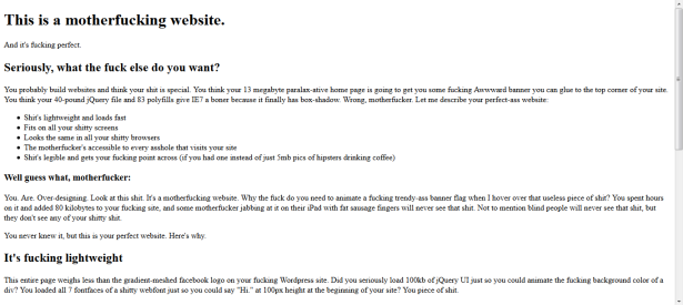
I recently stumbled upon motherfuckingwebsite.com, which is the most pragmatic and minimalistic approach to website creation I’ve seen so far (except for plain TXT files, of course). The first two lines read “This is a motherfucking website. And it’s fucking perfect.” The site has raised quite some attention on different social media platforms with lots of people stating that the guy who created it is absolutely right.
Basically, he says that the site is perfect because it loads fast, is accessible to everyone, is dead responsive (without using media queries), has content (i.e., it gets its “fucking point across”), uses semantic HTML5 tags etc. Most of the statements he makes are indeed right and there are undoubtedly lots of web designers out there who should take them to heart. The creator’s final note is that motherfuckingwebsite.com is “fucking satire”. His aim is to convey that websites are not broken by default. Instead, developers break them.
“Good design is as little design as possible.”
— Dieter Rams
Based on the facts that lots of people like the idea behind the site and that the creator makes a whole bunch of true points, I want to point out three things in which he is not completely right or that he passed over. These would bring a site of this kind closer to perfection, assuming that we follow a text-centric and device-agnostic approach.
- Line length: Text lines on motherfuckingwebsite.com span across the whole width of the viewport. This is particularly disadvantageous on large screens. An optimally readable line should contain only ~66 characters, which corresponds to ~30 em.1 To reduce the amount of scrolling, this
mustcan (Update July 23, 2016) be augmented with a multi-column layout and pagination.2 - Navigation: motherfuckingwebsite.com does not make statements about navigation. However, a website featuring larger amounts of content would require a navigation bar, optimally fixed to the top of the viewport.3 This navigation bar should adapt to smaller screens without device- or resolution-specific break points (= device-agnostic design).
- Aesthetics: motherfuckingwebsite.com follows a completely technical/functional point of view. Yet, this does not completely cover perfectness from the users’ perspective. Particularly, research has found that visual aesthetics are a crucial factor concerning user satisfaction.4 Even without excessive use of graphics this can be reached by leveraging more sophisticated color schemes and typography rather than just black/white coloring and default fonts.
Keeping the above points in mind, motherfuckingwebsite.com is for sure a good starting point for “back-to-the-roots”, minimalistic and device-agnostic web design.
Update (November 28, 2014): Please also pay attention to the follow-up posts based on this article, as well as the conference article published by Springer:
- motherfuckingwebsite.com Redesigned. My Other Poster Presented at #ICWE2014
- ICYMI: This is a motherfucking website and I wrote a motherfucking conference article about it
- http://link.springer.com/chapter/10.1007/978-3-319-08245-5_44
1 http://goldilocksapproach.com/article/
2 Michael Nebeling, Fabrice Matulic, Lucas Streit, and Moira C. Norrie (2011): “Adaptive Layout Template for Effective Web Content Presentation in Large-Screen Contexts”. In: Proc. DocEng.
3 Cf. http://www.dartlang.org/
4 Talia Lavie and Noam Tractinsky (2004): “Assessing dimensions of perceived visual aesthetics of websites”. International Journal of Human-Computer Studies, 60(3), pp. 269–298.
 2008 – Tales of Design & User Experience
[…] the Path to Content-centric and Device-agnostic Web Design” — This poster is based on one of my previous posts. It provides a review of motherfuckingwebsite.com, which satirically claims to be a perfect […]
LikeLike
[…] my original post about redesigning motherfuckingwebsite.com (see here), I have created a poster along with a corresponding short paper, which have been presented at the […]
LikeLike
If only it was 2014 and people could resize their ‘viewport’ to get the line length they prefer, instead of having an author force it to be too narrow.
LikeLike
All shit. The creator of motherfucker website should teach his 3 years old son to speak nothing but one word which should suffice his philosophical point of fucking view: FUCK YOU.
He should encourage his fucking son to strongly resist to illustrations and coloring or enhancement of any kind in his fucking homework to be submitted to his fucking teacher because according to motherfucker, his teacher who encourages his fucking son to enhance his work with art is not a follower of back-to-scratch minimalism, hence he deserves no respect from nobody but a whole post like motherfucker posted to fuck this teacher. Words are sufficient, why other things on an assignment, say motherfucker.
And motherfucker, just how well do you fuck your mother, can you write in the briefest way how you did it for us?
OMG, you said that was only a joke or something.
Mine is too.
LikeLike
My comment is very up to the point, if you fucker dare not post it, you are a real fucker who does one thing, write another.
LikeLike
Whoever you are,
get help!
Thanks,
Max
LikeLike
[…] my post about motherfuckingwebsite.com was featured on the front page of Y Combinator’s Hacker News. I was watching football with […]
LikeLike
My wording might seem angry but this is just how I write. I’m mildly annoyed/sardonic, but in general consider this post as agreeing with you with pretty much everything other then this 30em stance on line length. Yes, I did read the reference and I have to say one thing: acknowledging rising popularity of mobile devices and adapting layouts for them should not force people who work on larger displays to be uncomfortable with this ‘less then 25% of screen width’ column.
As of the line width: 30em, OK. But if you (I mean webdevs in general) do plan on making your website so universal that it will fit various devices it is absolutely OK as well. But please, please, PLEASE, start applying said multi-column layout if there is space or switch to something like “70% of available width” if you are hell-bent on single column. Mobile apps, netbooks, tablets and whatnot are popular, but that precious ‘mobile and user friendly’ looks awful on a panoramic screen with around 24″ or higher size. I have made a lot of custom global styles that actually increases readability. Ignore all font-sizes, force monospaced font, ignore line-width, force column to take 2/3 of the screen width. I don’t know about general experience, but this method sure beats the hell out of ‘user is too lazy to move his eye off centre’ approach. Or maybe I just read too fast and don’t like scrolling.
It’s like with programming in Python and that arbitrary PEP-8 adherence. These days I can’t buy anything that is not a wide screen. But with enforcing readability like that using numbers from 1980s’ and pretty amazingly versatile hardware profiles and displays, maybe it would be better if they were taken into account. Otherwise, why not push for changing from 16:9 displays to 9:16 and at least ensuring that laptops and PCs don’t have 60+% wasted on margins.
LikeLike
Hi Dave!
Totally agree on this. 30em line length must be combined with multi-column layouts on larger screens. The current problem is that you also need pagination then, because otherwise you keep scrolling down & up & down & up again to continue with the next column when you’ve finished the previous one. Unfortunately, there is not yet a reliable solution for this (at least I’ve not yet found one—if you know one, I’d be really happy if you told me), although some researchers are working on it (see the paper of Nebeling et al. I’ve referenced in the post). As soon as there is a convenient solution available (maybe even an accepted standard), I won’t hesitate a second to apply it. Now that I think about it, I guess I should also adjust the post to say “…this [must] be augmented with a multi-column layout and pagination.”
Thanks for your input!
Best,
Max
LikeLike
Not really, sorry that I took some of my frustrations on you by the way. I have found this post of yours literally the same day I got into heated argument with one web designer who told me to my face that my colour blindness (most of the spectrum, I have near total lack of red-green differentiation and most of the brighter colours are to me almost indistinguishable below some threshold) is a non-problem and I should ‘fuck off from the websites designed for normal people’. Delayed apologies, but I hope that this context helps to excuse me at least a little bit.
The styles that I’m making are utilising Stylish extension, any website will get compressed to a single column of fixed width with some additional flavouring to help with links. I’m also forcing browser engine to render most of the stuff in grey scale and change the background on all of the links that I’m hovering over. I have one template that I’m just tweaking slightly if it does not on some website but I am likely to visit it regularly. While I can’t access my style base at the moment, I can share them later if you are interested. Nothing much you could not deduce from the above description though. I’m not a web designer, just a maths researcher who gets easily frustrated over little things like that ;). I can offer my help from that side, but while I do have the mental tools for handling optimisation, I was never interested in design so it’s likely that I would be more of a hindrance than help.
Truth be told, I admire the fact that you are approaching readability as the major concern and want to go for more minimalistic approach then A LOT of webdevs. There are websites that use this cancer of a solution where data is displayed basically as slides, everything tries to get rendered on top priority etc. I’m on a computer capable of simulating insane numbers of electrons on superconductor wafer layers, constantly interacting with majority of their neighbours, before redirecting it to run on a supercomputer… and yet there are websites that grind its performance to the ground. I’m glad that this fad is dying out.
LikeLike