Some time ago, when I was still more active on Google+, I used to share a funny little animated GIF from time to time. Not just any semi-funny GIF I came across, but only those that made me laugh really hard and at which I could look a thousand times without becoming bored of them.

Then, when I sat over a boring research paper and started to become demotivated, I would usually scroll through my Google+ timeline, check out one of the GIFs and laugh for five minutes. After that, I was in a good enough mood to finally finish that paper (or whatever other shitty task I had to do). Yet, it’s obviously not convenient to regularly scroll back through one’s Google+ timeline for finding one’s favorite GIFs or to organize them as bookmarks in the browser (point I).
Not so long ago, I stumbled upon Material Design Lite, which I really wanted to play around with since then; but I was lacking a nice use case (point II). Points I & II then finally led to the creation of ‘Good Mood’ as a part of my personal website MaxSpeicher.com. ‘Good Mood’ shall serve as a curated collection of my favorite GIFs, which I also intend to extend in the future. Whenever you’re having a bad day, you can go there, laugh a bit and then go on with a (hopefully) better mood than before 🙂
Now comes the geeky part: As a part of my website, the back end of ‘Good Mood’ is based on Node.js in combination with Express. The front end HTML is generated from Jade templates and—obviously—uses the Material Design Lite framework. However, during the creation of the site, there were some little obstacles to overcome.
I started with the front page of ‘Good Mood’, on which I show a random GIF from my collection. That one was pretty easy. But I thought one might also want to check out a specific GIF from time to time. So I decided to provide a second page on which the whole collection is featured.
How to Load Images Asynchronously as Soon as They Enter the Viewport
Problem 1: Animated GIFs are usually pretty heavyweight, so it’s not optimal to load the whole page with all GIFs, particularly if it’s accessed on the go via smart phone or alike.
The solution to this one was pretty straightforward: a GIF should be loaded only if the user has scrolled to the respective position, i.e., the image enters the viewport. For this, I register a waypoint for each material card displaying a GIF:
$.registerWaypoint = function($element, func) {
  waypoints.push({
    t: $element.offset().top, // top
    b: $element.offset().top + $element.outerHeight(), // bottom
    func: func
  });
};
In the above code, func is the callback function for asynchronously loading the GIF once the viewport reaches the corresponding waypoint:
$.loadCardImgAsync = function(cardCssClass, imgSrc) {
  var asyncImg = new Image();
  asyncImg.onload = function() {
    $('.' + cardCssClass + ' > .mdl-card__title').addClass('bg-img');
  };
  asyncImg.src = imgSrc;
};
In this case, I simply add a predefined CSS class bg-img to the respective card, which displays the GIF in terms of a background-image after it has been loaded as a new Image object.
Finally, we need a function for checking the waypoints against the current scrolling offset and viewport height. That function is bound to the window’s scroll event. Once a waypoint is reached by the viewport—entering from either the top or the bottom—, its callback function is executed and the waypoint is removed from the array of waypoints. In order to not mess up the array indexes after having removed an element, I iterate backwards using a while loop.
checkWaypoints = function() {
  var i = waypoints.length;
  while (i--) {
    waypoint = waypoints[i];
    if (waypoint.t < currentOffset + windowHeight && waypoint.t > currentOffset
        || waypoint.b > currentOffset && waypoint.b < currentOffset + windowHeight) {
      waypoint.func();
      waypoints.splice(i,1);
    }
  }
};
How to Dynamically Adjust Background Images to Mobile Viewports with CSS
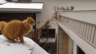
Problem 2: The GIF with the cat was too wide for the mobile view of the page, which made horizontal scrolling necessary. But: Horizontal scrolling is pretty uncool!
This problem was a bit trickier than the previous one, mostly because it involved CSS*. When working with <img> tags, we can simply give them a max-width of 100% and omit the height property, so that the correct aspect ratio is automatically retained. However, since I use material design cards, I had to deal with <div> elements and the CSS background-image property. Unfortunately, those don’t know which height they must have unless we tell them. Say, for instance, the animated GIF we’re dealing with is 400 pixels wide and 225 pixels high. Then, we need the following structure according to material design cards:
div.mdl-card.mdl-shadow--4dp(class='#{card.cssClass}')
  div.mdl-card__title.bg-img
  div.mdl-card__supporting-text Found at
  div.mdl-card__actions.mdl-card--border
    a.mdl-button.mdl-button--colored.mdl-js-button.mdl-js-ripple-effect(href='#{card.link}', target='_blank')
      i.fa.fa-google-plus
      | /#{card.caption}
First, we have to give the container <div> element a width of 400 pixels and a max-width of 90% (to give it some space to the left and right on small screens), but we make no statement about its height:
.cat-card.mdl-card {
  display: inline-block;
  width: 400px;
  max-width: 90%;
}
The height of the container then must be determined by the inner <div> element that actually has the background-image property. In order to do so dynamically, it needs a padding-top value that reflects the aspect ratio of the background image. In our case, that would be 225 / 400 = 0.5625 = 56.25%.
.cat-card > .mdl-card__title.bg-img {
  background: url('/images/gif/cat.gif') center / cover;
  color: #fff;
  padding-top: 56.25%;
}
Now, since the padding of the inner <div> is relative to the actual width of the container <div>, the height of the container automatically adjusts to retain the correct aspect ratio of the background image. Go check out CodePen, where I had first sketched the solution to this. Yet, we need one more piece of the puzzle, which goes into the header of the HTML page:
<meta name="viewport" content="width=device-width, initial-scale=1.0" />
Aaand done! Enjoy—both the website and the source code, which is also available on GitHub!
 2008 – Tales of Design & User Experience