3 Lessons I Learned as the “Chief Data Analyst” of a Silicon Valley–funded Start-up
From 2015 till 2017 I helped grow HoloBuilder Inc., a start-up providing virtual reality solutions for the construction industry, as their VP of Customer & Data Analytics & Optimization, which roughly translates to “Chief Data Analyst”. The company is headquartered in San Francisco while I was a part of their R&D lab in Aachen, Germany. I was responsible for the whole data analytics* pipeline — from collecting data on the web platform using Google Analytics and own trackers to processing the data in Google BigQuery and visualizing it using tools like Power BI and Klipfolio. During my time in Aachen I learned lots of valuable lessons. Here, I want to share with you the three most important ones that are directly concerned with data analytics (please scroll down for a TL;DR).
1. Data Analytics ≈ UX Design
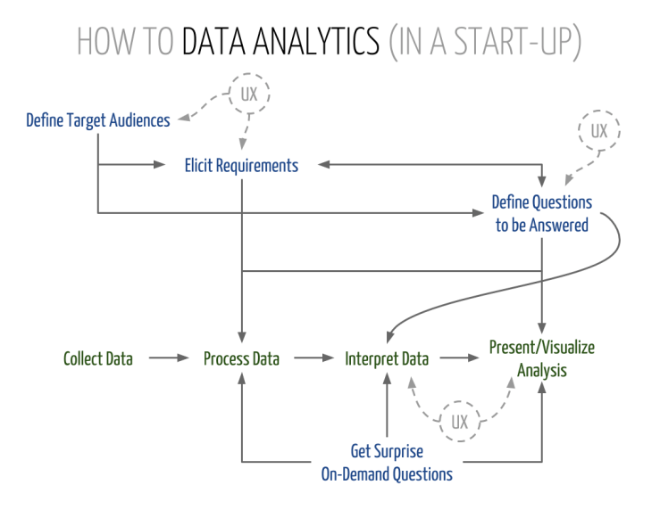
Data analytics is a lot like UX design. You have specific target audiences that expect to experience what you provide them with in the most optimal way — concerning content, presentation, and possibly interactivity. For instance, providing data for C-level management and for potential investors are two completely different stories. While management requires low-level insights concerning the software itself, among other things, for VCs we usually prepared more high-level business metrics including projections and forecasts, due to the different requirements. Moreover, internal data would usually be provided through dynamic dashboards that could be adjusted and customized while data for investors would rather be delivered in the form of PowerPoint slides that matched the layout of the pitch deck. Therefore, it is crucial to have the definition of a target audience (potentially even personas) and a requirements elicitation from that audience at the beginning of every data science process. At HoloBuilder Inc., this lesson became especially clear because of the split between San Francisco and Germany and the fact that most of the (potential) VCs were residing in the Silicon Valley.
I am convinced that a data analyst without some proper UX skills — and, of course, adequate requirements and input — cannot be successful.
2. Ask the Right Questions — and Do So early
This one goes hand in hand with requirements elicitation. Don’t provide analyses just for the sake of it!
This whole “let’s just analyze everything we can get” thing doesn’t work! It’s extremely important to define the questions you intend to answer beforehand. Tracking is cheap, so you can (and should!) track more than you need (at the moment). But the processing and visualization of data that nobody ever looks at eats up a whole lot of resources that would be required for the meaningful analysis and presentation of the few nuggets that are buried in your giant pile of big data. Also, having concrete questions in mind greatly helps with tailoring data structures more precisely to your specific needs. Of course, this doesn’t mean that your infrastructure doesn’t have to be flexible enough to quickly react to changing and new questions that need to be answered. In an optimal world, the data for answering new questions is already there and you “just” have to do the processing and visualization. In general: Expect surprise on-demand questions anytime! Therefore, anticipate and be prepared!
(While the questions that need to be answered can be seen as part of the requirements elicitation, I treat them separately here, because I give requirements a more technical connotation — e.g., “possibility to toggle between line/bar charts” or “include difference to previous period in %” — compared to key questions such as “Why do we lose users?”.)
3. Data is Meaningless …
… unless you give it meaning by interpreting it. For this, it’s inherently important to not think in silos. A data analytics team has to closely cooperate with the UX team and (almost) all other teams in the company in order to find meaningful interpretations or reasons for the collected data. Yet, this is still not the norm in industry. For instance, there is still the widely believed misconception that A/B testing = usability testing.
To ensure meaningful data analytics, at HoloBuilder Inc., marketing manager Harry Handorf and I developed a boilerplate for a weekly KPI report that posed three crucial questions:
- Which data did we collect?
- What are the reasons the data looks like that?
- What actions must/should be taken based on the above?
That is, the first part delivered the hard facts; the second part explained these numbers (e.g., less sign-ups due to change in UI); and the third part presented concrete calls to action (e.g., undo UI change). The report looked at those questions from the platform as well as the marketing perspective. Therefore, we had to extensively collaborate with software engineers, designers, UX people, marketing and sales to find meaningful answers. According to the second learning above, the basis of the report always were higher-level questions defined beforehand, such as: “Does the new tutorial work?”, “How can we gain more customers?”, and “Have we reached our target growth?”. In general, the interpretation of data is based on the processed data and the questions to be answered, rather than on technical requirements (see infographic above).
Again, because this is really important: Your data is worth nothing without proper interpretation and input from outside the data analytics department.
Ultimately, to conclude this article, I don’t want to withhold from you Harry’s take on the topic:
You might have heard of the metaphor for life feeling like a tornado. It perfectly applies to working with data of a young business — it spins you around with all of its metrics, data points and things you COULD measure. It’s noisy and wild. A good data scientist figures out how to step out of it. But that does not mean getting out of the tornado completely, letting it do its thing and becoming a passive spectator. It means getting inward, to the eye. Where silence and clarity allow for a better picture of what’s going on around you, defining appropriate KPIs and asking the right, well thought-out questions.”
—Harry Handorf (tornado tamer)
TL;DR
- Data analytics is a lot like UX design! As a data analyst, you have to define target audiences and elicit requirements. Tailor content & presentation of your analyses to those.
- Define the questions to be answered beforehand, then process and interpret the data necessary to answer those questions. Don’t analyze everything you can just for the sake of it.
- Data is meaningless without interpretation. Extensively collaborate with other departments — especially UX — to ensure meaningful data analytics.
(This article has also been published in Startups.co on Medium.)
Footnotes
* What we did at HoloBuilder Inc. was clearly a mix of data analytics and data science. But since it was closer to the analytics part, I refer to it as data analytics in this article. In case you are interested in the specific differences between the two (and how difficult it is to tell them apart), I recommend reading the Wikipedia articles about data science and data analytics, as well as “Data Analytics vs Data Science: Two Separate, but Interconnected Disciplines” by Jerry A. Smith.
Acknowledgments
Special thanks go to Harry for proofreading the article & his valuable input.
