TL;DR: After analyzing my old website, I decided to put more emphasis on (1) identifying and highlighting the pieces of information that are actually useful and (2) a two-dimensional approach to displaying my CV along traditional categories and skills/topics. Moreover, I set myself design constraints that forced me to keep my new website as clean and simple as possible, following the design philosophies of brutalism and Mies van der Rohe.
My new website has been up and running for a few weeks now and I suppose it might seem unusual to some of you. Therefore, in this post, I want to explain how I ended up with what I did. What motivated me to create a new website was the fact that OpenShift v2 was shut down by Red Hat and the new version of their hosting service was so unsatisfying that I decided to move to Github pages instead. This, however, also meant that I could not build on a Node server anymore, so I took the opportunity to start over with a blank slate and create something completely different.
Core Questions
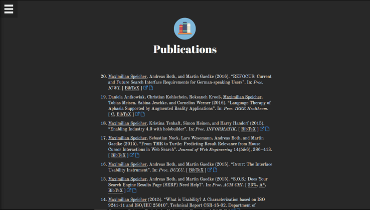
As a first step, I analyzed my old website, and I noticed two things. First, it was more or less structured exactly like my CV, which is, to be honest, not the most creative way to lay out an online presence. Second, my publications were listed in a format that I would also use in the reference section of an actual research paper. However, that format was only really understandable and readable for scientists, which—as I could safely assume—excluded a certain amount of my visitors. After all, the only necessary pieces of information are the title (plus a link for those who want to have a closer look), the list of authors, and which topics the paper is actually about. From a title like “Ensuring Web Interface Quality through Usability-based Split Testing” one may conclude that I’ve done work on usability, but how would you know that this publication also addresses analytics and machine learning without reading it? The acronym of the conference where it was published or the CORE rating of that conference certainly don’t help the average user.
Therefore, the two central questions that informed the design of my new website were:
- How can I present my work and skills in a better, more useful, and more memorable way than the standard paper CV structure—projects, work, education, etc.?
- How can I more effectively communicate to people the topics I actually worked on and which skills I acquired rather than just telling them that I was an “Intern R&D at Unister”?
Design Constraints
Additionally, I set myself the following design constraints to ensure I had to come up with something completely different and create a novel, unusual, and more memorable experience. The main drivers for these constraints were my love for minimalism and a desire to prevent unnecessary overhead as much as possible.
- Make it brutalist. Originally, brutalism was an architectural movement known for “its ruggedness and lack of concern to look comfortable or easy”. Accordingly, brutalist websites have a rough, simple, and unfinished look. They are almost nihilistic towards user experience.
- Make it as simple as possible. I chose this constraint in accordance with Mies van der Rohe’s architectural philosophy of “extreme clarity and simplicity”. He made his buildings purely functional and refrained from using anything ornamental.
- Don’t use icons or images. Standalone icons are a bad idea in most of the cases anyway (as this nice summary explains). This led me to using smaller text with a solid, edgy border in places where I used icons for social media sites and the different sections on my old website.
- Use only one primary color. The rest must be kept in black, white, and gray.
- Work with typography as much as possible. Apart from the one primary color and white space, I tried to use only different font sizes and weights for structuring and highlighting information.
Finally, I came up with and realized a concept that is largely based on hashtags to communicate my skills and the topics I’ve worked on. Every CV entry on my website—be it a university degree, a job, or a publication—is annotated with a set of such tags. The entry about “Ensuring Web Interface Quality through Usability-based Split Testing” now tells the visitor that the paper is about #analytics and #machine learning, among other things. At the top of the page, I feature a list of skills that enables users to filter the page and hide everything that’s not related to a specific skill or topic they’re interested in. Moreover, I chose a two-dimensional approach to presenting my CV. That is, the visitor has the chance to display it either according to the traditional structure of a CV, or grouped by skill/topic. In the latter case, all CV entries that feature a certain tag are displayed in the corresponding section to be able to view them at a glance.
Technology-wise, my new website is based on standard web technologies, Less, and gulp.

Why I Don’t User Test My New Website
I asked some friends to have a look at what I created and they immediately came up with the idea of having a sticky menu—as they are used to from other websites—so that they wouldn’t have to go back to the top of the page (using the #top button in the bottom right corner) when they wanted to change the current filter or the way the CV is displayed. I started implementing this supposed improvement yesterday, but became more and more dissatisfied the more I progressed. While it would have made the website slightly more usable (sparing users a click from time to time), a sticky menu would violate the constraints that define my design and would make my website less unique in my opinion. After all, the average user prefers being confronted with and using things they already know. Therefore, I abandoned the idea and did not deploy the changes.
In this sense, the design of my new website is clearly not 100% user-centered, but rather an experimental piece of art.
Did I manage to intrigue you? Feel free to have a look at http://www.maxspeicher.com/v2.
 2008 – Tales of Design & User Experience